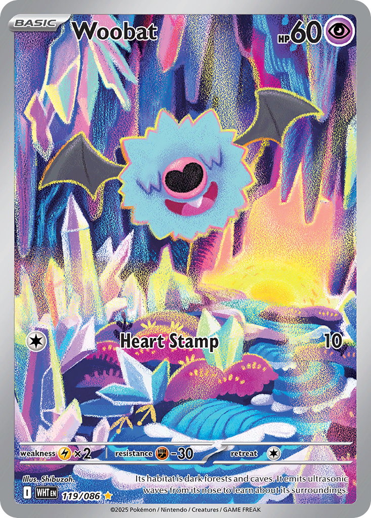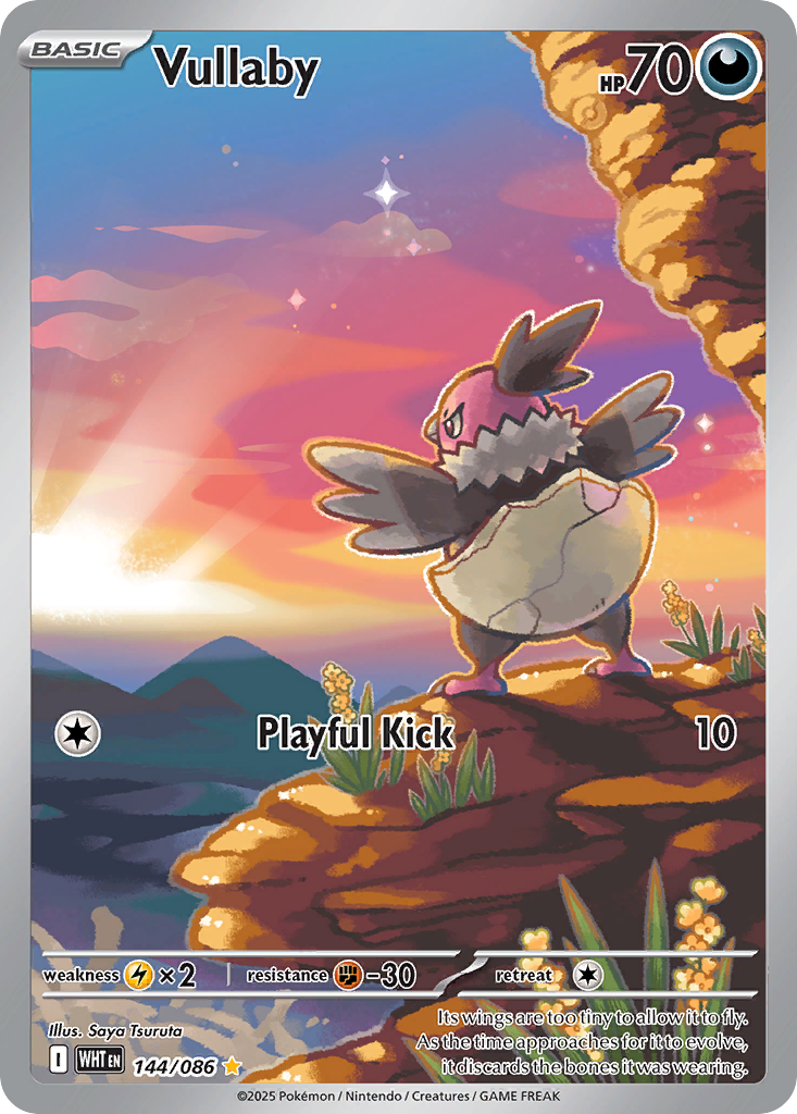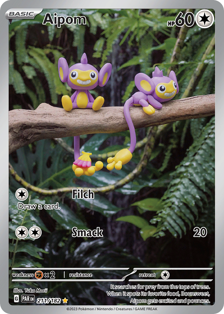
Pick up a Yuka Morii card and something feels off in the best possible way. The Pokemon has a soft edge that a drawing does not have. The leaves behind it are too detailed. The shadow falls the wrong way for an illustration and exactly the right way for an afternoon. That is because you are not looking at a painting at all. You are looking at a photograph. Morii is the pokemon card artist who builds every Pokemon out of clay, sets it down in a real place, and takes its picture.
Who is Yuka Morii
Morii is a professional clay modeler, and the Pokemon TCG is only one of the places her work shows up.
According to her Bulbapedia illustrator page, she graduated from Tokyo Zokei University and earned an MA in Living Design at the Kuwasawa Design Institute, where the same page notes she now teaches illustration part time. Outside Pokemon she has designed mascots for companies, published art and culture books, and illustrated two Pokemon Tales picture books that never released outside Japan.
Her Pokemon career is older than most collectors realize. Bulbapedia records her first card as a jumbo CoroCoro promo from 1998, and says she began producing card artwork regularly in 2000, starting with Caterpie, Kabuto, Corsola and Omanyte in the Japanese set Crossing the Ruins. Those four became her first cards to reach English players when they were printed in Neo Discovery in 2001. She has worked with the Pokemon Card Laboratory continuously since.
The scale of that run is easy to miss because of where her cards sit. A live artist search on the Pokemon TCG API returns 204 English cards credited to Yuka Morii, spanning sets released from 2001 through 2025. That is a quarter century of continuous work. It puts her in the same veteran bracket as illustrators like Naoyo Kimura, except that Morii spent the entire time doing something no other regular contributor does.
Her signature style
The technique is the style. Bulbapedia describes it plainly: Morii sculpts the Pokemon in the same style as her other clay work, then photographs the finished model against arranged scenery or an actual location. Every visual quirk of her cards follows from that one decision, and once you know what to look for you can call a Morii from across a table.
Look at the surface first. Clay takes light differently than paint does. Her Pokemon have a matte, slightly waxy sheen with soft rounded edges and no linework anywhere, because there is no line to draw. Colors sit in flat blocks with a faint fingerprint texture. Nothing is airbrushed and nothing glows.
Then look at the background. This is the giveaway. Her settings are frequently real photographs: actual ferns, actual bark, real brick paving with real grit in the joints, genuine depth of field that blurs the far leaves into soft green. No illustrator can fake that falloff, and no illustration needs to.
Then look at the shadow. Her models cast contact shadows onto whatever they are sitting on, and the light source is usually a real one, often overcast daylight. The Pokemon sit in the world instead of floating in front of it.
Last, the mood. Her Pokemon are almost always still. They perch, sit, stand and look mildly pleased. There is no action in a Morii card, because a clay model cannot move, and she has turned that limit into her whole register. The result is calm, handmade and quietly funny.
Cards to know
Her catalog is unusual in its shape. Of those 204 cards, 127 are Commons and 39 are Uncommons, and she has only two Illustration Rares and no Special Illustration Rare at all. Her best work is scattered through the parts of a set most people bulk out.
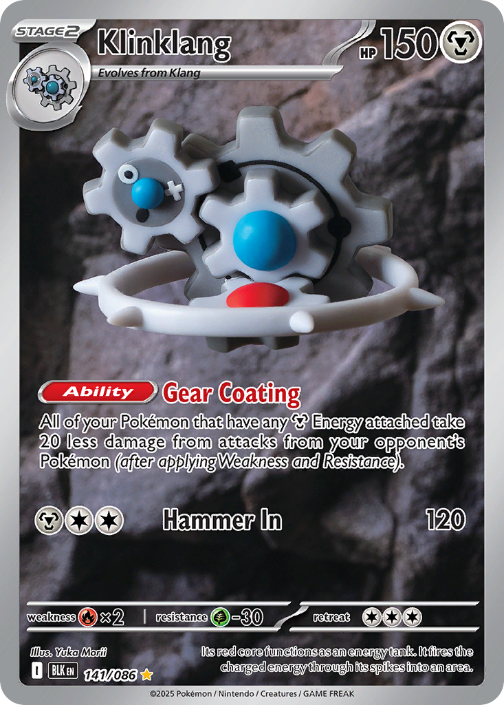
Klinklang, Black Bolt 141/086, Illustration Rare. Her most recent showpiece and a genuinely strange object. Klinklang is a machine, all steel gears, and Morii built it out of soft grey clay with a glossy blue bead for an eye, then propped it against a real stone wall. A steel type rendered in the least steel material available.
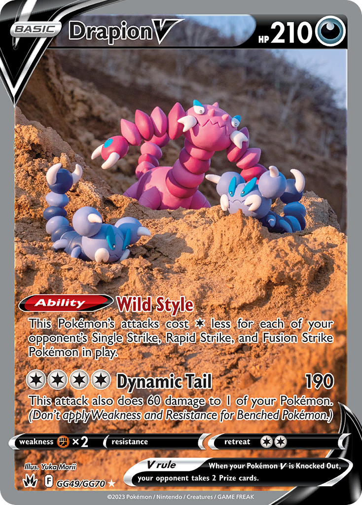
Drapion V, Crown Zenith Galarian Gallery GG49/GG70. Her rarest slot by print treatment and her most cinematic staging. A pink Drapion rears up out of orange sand with two blue Skorupi flanking it, shot low against a real cliff face at golden hour. The scale illusion is total.
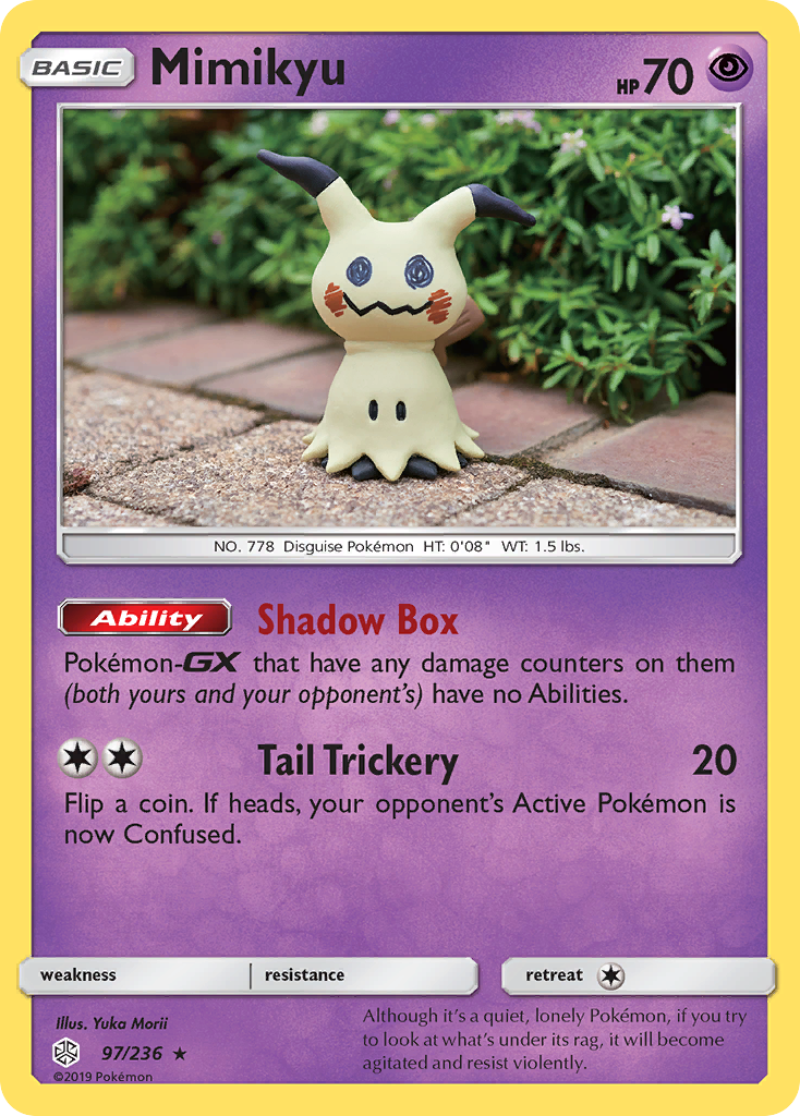
Mimikyu, Cosmic Eclipse 97/236. A plain Rare, and one of the best Mimikyu cards ever printed. The rag is genuinely cloth colored clay, the crayon face is drawn on by hand, and it stands alone on a brick garden path next to a hedge. A Pokemon defined by pretending to be a homemade object, made as a homemade object.
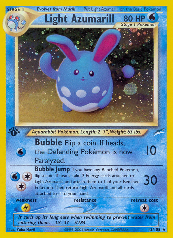
Light Azumarill, Neo Destiny 13/105. From 2002, and proof the method was fully formed from the start. A round blue Azumarill mid bounce, one ear up, against a dark field where the holo pattern reads as falling snow. Twenty four years old and it still looks like a photograph of a toy you want.
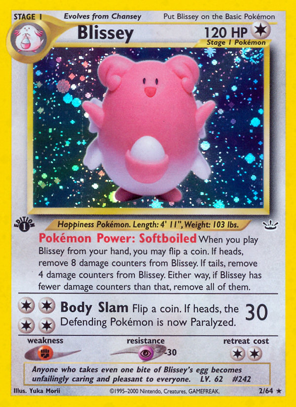
Blissey, Neo Revelation 2/64. Her earliest holo on this list and the softest thing she has made. A pink Blissey holding its egg, floating in a starfield of holo confetti. The clay body catches a single highlight and that is the entire lighting plan.
The cover card above is Aipom, Paradox Rift 211/182, her other Illustration Rare and the clearest demonstration of the whole method. Two purple Aipom, one sitting and one hanging by its tail, balanced on an actual branch in front of actual wet ferns. The hand tail is sculpted with individual fingers. Nothing about it could be mistaken for a drawing.
Build a Yuka Morii binder page
A Morii page is the single best value in artist collecting, and the reason is that rarity chart above.
Because 127 of her cards are Commons, you can build a full nine card page of her work for close to nothing. There is no chase card gatekeeping the set, because she does not have one. Pull Litwick, Snom, Joltik, Seedot, Sinistea, Torchic, Pincurchin and Ducklett out of a bulk box and you have most of a page for the price of the sleeves.
The page will also look better than a page of expensive cards, which is the surprising part. Her work has a stronger visual through line than almost any other illustrator because the medium never changes. Nine clay Pokemon photographed in nine real places share a texture, a softness and a light quality that nine paintings never will. The page reads as one body of work instead of nine loose cards. If you want the same effect from a wildly different direction, our Tomokazu Komiya feature covers the other illustrator whose style is so specific that a page of it becomes a single statement.
For layout, sort by the background rather than by the Pokemon. Group the forest and fern shots together, the stone and brick shots together, the studio starfield holos together. Her real location photography means each card carries an environment, and grouping environments turns the page into a walk. Put Aipom or Drapion V in the center for the strongest single image, and let the Commons carry the ring. Our guide to organizing a Pokemon binder covers the artist grouping and color sorting fundamentals if you are setting up your first themed page.
Morii is the illustrator who proves that the interesting cards are not always the expensive ones. She has been quietly sculpting Pokemon out of clay and carrying them outside to photograph them for twenty five years, and almost all of that work ended up in the Common slot where nobody was looking. Learn the texture and you will start spotting her in every bulk box you sort. It is the cheapest way to make a binder page that looks like nothing else on the shelf.