Most Pokemon cards are painted. Jerky's cards are built. Flat planes of color locked inside hard black outlines, almost no soft shading anywhere, the kind of drawing that would survive being printed on a vinyl sticker or a train station poster. Pull one out of a pack and it does not sit politely next to the rest of the set. If you have ever wondered who the pokemon card artist behind the Obsidian Flames Pidgeot ex is, this is them, and their catalog is one of the most fun artist binder pages you can build right now.
Who is Jerky
According to their Bulbapedia illustrator page, Jerky (Japanese: ジャーキー), also known as Banana Jerky, is a Japanese freelance illustrator, and their first Pokemon Trading Card Game card was Lumineon V from the Crown Zenith Galarian Gallery. That is a steep place to start. Most new illustrators debut on a common with a Pokemon standing in a field. Jerky debuted on a full art.
A live artist search against the Pokemon TCG API returns 39 English cards credited to Jerky, running from Crown Zenith in January 2023 to a Wimpod in Delta Reign dated November 2026. The illustrator database Art of PKM, which tracks both products together, counts 109 pieces in total once Japanese prints and Pokemon TCG Pocket are included, 82 on the physical card game and 27 in Pocket. By that count Jerky has drawn Tatsugiri eleven times, which is a specific kind of devotion.
Bulbapedia describes the style as a distinctive color blocking technique with vibrant, high-contrast colors, citing an official Pokemon.com artist spotlight from July 2025. That Pokemon.com article URL now returns a 404, so Bulbapedia's record of it is the surviving reference. Jerky posts as bananajerky on Instagram and Bluesky and keeps a portfolio at banana-jerky.com.
Their signature style
Color blocking sounds like a fashion term. On a card it means something very concrete, and once you see it you cannot unsee it.
Start with the outlines. Jerky draws a thick, slightly wobbly black contour around almost everything, including background shapes that other illustrators would let dissolve into haze. Trees, buildings, clouds and road furniture all get the same weight of line as the Pokemon. The effect is closer to screen printing or a picture book than to the airbrushed look that dominates modern full arts.
Then the fill. Inside those outlines the color is flat. A sky is one blue. A hillside is one green, or two greens stacked as separate shapes rather than blended into each other. When Jerky wants depth, they do not reach for a gradient, they add another hard-edged plane in a different value and let the shapes overlap. The Tapu Koko card below is the clearest demonstration: a sunset built from about eight solid bands of magenta, purple, orange and cyan, with the sun itself drawn as stripes.
Last, the color choices are loud and deliberately mismatched. A yellow sky over green trees. Teal night air behind a brick-red roof. Jerky treats local color as a suggestion and picks whatever makes the shapes pop hardest, which is why their cards read from across a table. In a binder page full of pastel watercolor and chrome texture, a Jerky is the panel your eye lands on first.
Cards to know
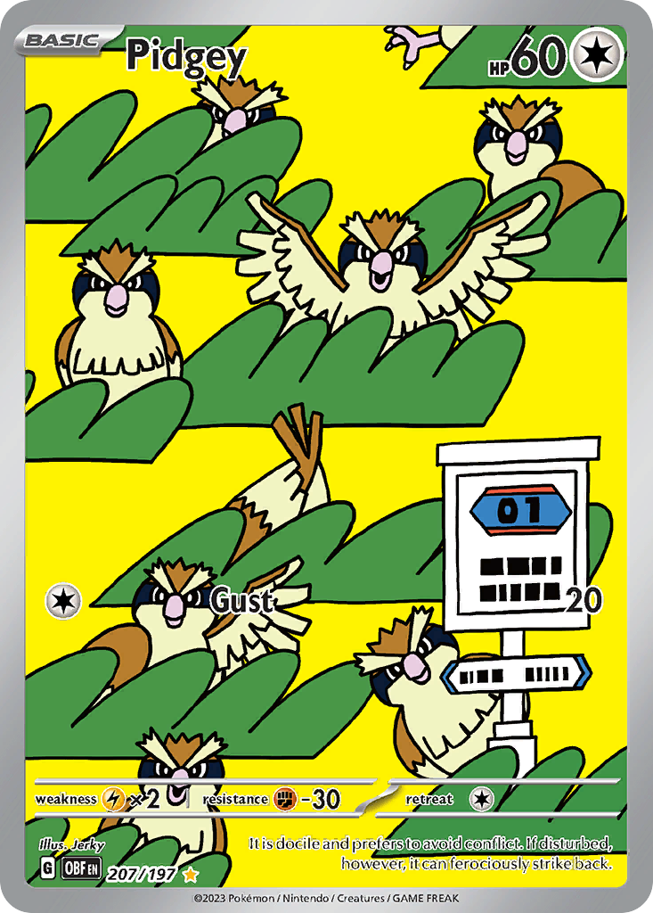
Pidgey, Obsidian Flames 207/197. Seven Pidgey scattered across a flat yellow sky and a stack of green hedge shapes, with a roadside signboard at the lower right. No horizon, no perspective, no shading. It is the purest color block card in the set.
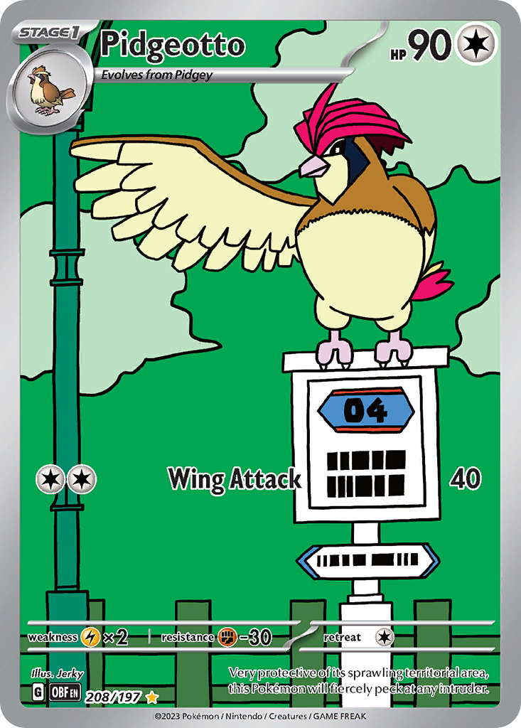
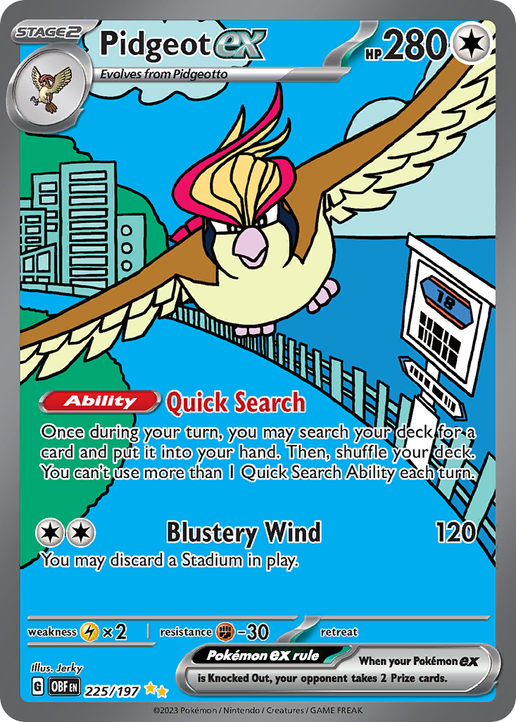
Pidgeotto, Obsidian Flames 208/197. The same world, one evolution later, and the frame has quietly become a city street: a lamp post, a guard rail, a signboard the Pidgeotto is now perched on top of. Here is the detail worth the whole post. Crop into those signboards on all three cards and the route number climbs with the evolution line. Pidgey's sign reads 01, Pidgeotto's reads 04, and the cover card's reads 18. One illustrator, three slots in one set, one continuous road. Our feature on the legendary birds connected illustration rares covers the more famous version of this trick, where the art panels physically join; Jerky's is the subtler version, where only the signage gives it away.
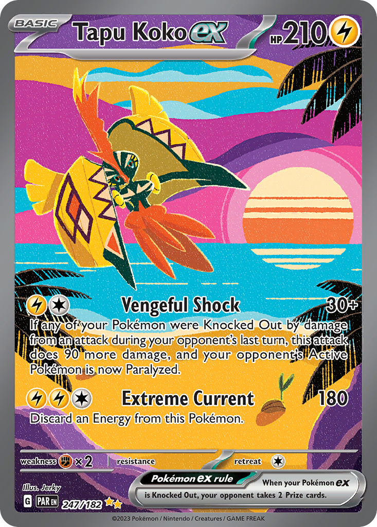
Tapu Koko ex, Paradox Rift 247/182. The Special Illustration Rare that made a lot of people check the credit line. An Alolan sunset rendered as stacked ribbons of magenta, violet, orange and sky blue, palm fronds cut out in pure black, and Tapu Koko descending through the middle in yellow and vermilion. It is the loudest card in the set and it does not use a single gradient.
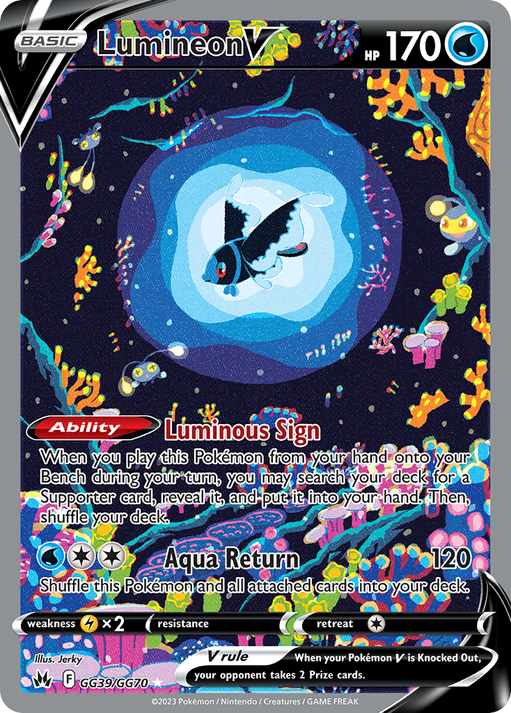
Lumineon V, Crown Zenith Galarian Gallery GG39/GG70. The debut. A deep sea floor built from hundreds of tiny flat shapes in acid green, hot pink, coral and yellow, with Lumineon suspended in a halo of concentric blue rings. Two curious Lanturn hang at the edges. Jerky's first card already had the finished style on it.
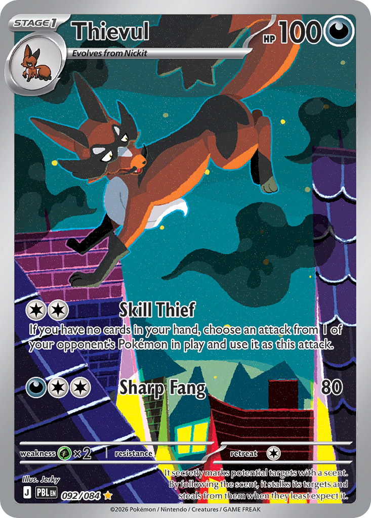
Thievul, Pitch Black 092/084. Three years on, from a 2026 set. Thievul mid-leap over rooftops in teal night air, with the tiles and chimneys below broken into purple, yellow and magenta planes. The outlines have loosened and there is a faint grain over the flats now, which is the one real evolution in the style.
The cover card is Pidgeot ex, Obsidian Flames 225/197, the Special Illustration Rare that caps the run. Pidgeot comes at you head on with its wings spanning the full width of the card, the city reduced to three teal boxes on the left, the sky a single sheet of blue, and that route 18 signboard on the right.
Build a Jerky binder page
Artist pages live or die on visual consistency, and Jerky gives you an unusual version of it. The palette is not consistent at all, every card picks a different wild color scheme. What is consistent is the drawing logic: same line weight, same flat fills, same refusal to blend. That means a nine pocket page of Jerky art looks coherent in structure while staying riotous in color, which is a much more interesting page than nine cards that all match.
Build it as a grid rather than a gradient. Put Pidgeot ex or Tapu Koko ex in the center pocket as the anchor, then alternate warm and cool cards around it so no two neighbors share a dominant hue. The hard outlines act like leading in stained glass and will hold the page together even when the colors fight. Our guide to organizing a Pokemon binder walks through artist grouping and color sorting if you want the general method before committing a page to one illustrator.
The cost side is friendly. Only two of the cards here are Special Illustration Rares. The Pidgey and Pidgeotto illustration rares, the Tropius, the Hydrapple, the Archeops and the recent Thievul are all ordinary pulls, and Jerky has a long tail of commons and uncommons in the same style that cost almost nothing. If you want a companion artist page with the opposite temperature, the sowsow feature pairs well, since sowsow works in exactly the soft atmosphere Jerky throws out.
Learn this one by the outlines, not the subject. Jerky is the illustrator who decided a Pokemon card could look like a poster instead of a painting, and then kept the nerve to put a numbered road sign in the corner of three cards so the people paying attention would find it. Go build the page.