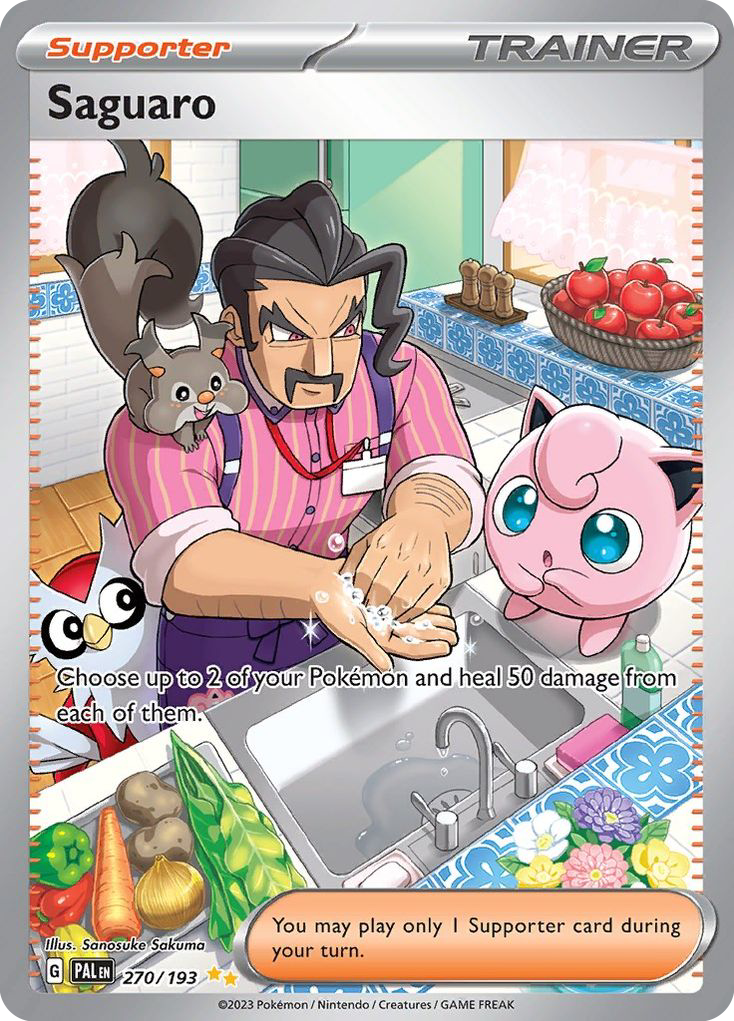
Most Pokemon card art is about the Pokemon. Then there is a card where a middle aged man in a striped shirt is washing his hands at a kitchen sink while a Jigglypuff watches him do it, and the whole thing is so warm and so ordinary that you forget you are looking at a game piece. That is Sanosuke Sakuma. She is the pokemon card artist who draws the people, and once you learn her name you start finding her in the least glamorous slots of every set you own.
Who is Sanosuke Sakuma
Sakuma is one of the rare illustrators who works on both sides of the franchise, and that is the key to reading her cards.
According to her Bulbapedia illustrator page, she began providing artwork for the Pokemon Trading Card Game in 2013, with her first illustrations appearing on cards released in the Shiny Collection. The same page notes she began drawing from an early age with a particular interest in anime and manga, and that she was head of the manga club at both high school and college. She draws digitally, and Bulbapedia lists Adobe Photoshop as her application of choice.
Here is the part that reframes her whole catalog. Bulbapedia credits her as a character designer on Pokemon Sun and Moon and Pokemon Sword and Shield, where she created many of those games' various Trainer classes. Trainer classes are the job titles you battle on every route: the Cook, the Worker, the Dancer, the Doctor, the Cafe Master. They are the background population of the Pokemon world.
Now look at her card list. A live artist search on the Pokemon TCG API returns 163 English cards credited to her, and the Supporter slots are full of those exact job titles. Cook. Dancer. Worker. Doctor. Cafe Master. She is not illustrating anonymous extras. She is illustrating the same kind of everyday character work she was already doing for the games, which is why her cards feel less like posters and more like someone's neighbors.
Her signature style
Bulbapedia describes her specialty as cute characters and a warm atmosphere, built on a specific color palette and a soft drawing style. That is accurate but it undersells how identifiable the result is. Here is how to spot a Sakuma in a binder from across the table.
First, the faces are specific rather than pretty. Her Saguaro has a heavy black moustache, a hard stare and lines under his eyes. Her Cafe Master is a barrel chested older man with grey at the temples and a satisfied half smile. She draws age, weight and posture, which most card artists quietly avoid. Nobody in her work is a generic anime lead.
Second, the setting is doing real work. Sakuma fills the frame with domestic clutter and then lights it softly: patterned blue tile, a basket of apples, vegetables on the counter, shelves of jars behind a counter, sunbeams coming down through trees. Her backgrounds are not a wash of sparkle behind a character. They are rooms and places, and they are usually somewhere pleasant.
Third, the palette stays gentle. She leans on cream, warm wood, soft pink, sage and pale blue, and she keeps her contrast low. Even her action poses read as friendly rather than dramatic. When you set her cards next to a high contrast full art, the Sakuma is the one that looks like afternoon light.
Last, look for the small joke. A Jigglypuff at eye level with a running tap. A soft serve held up to the camera like a trophy. She almost always gives the scene one moment of comedy instead of one moment of spectacle.
Cards to know
Her strongest work spans about five years and sits mostly in Trainer slots, so this handful skips across eras and rarities.
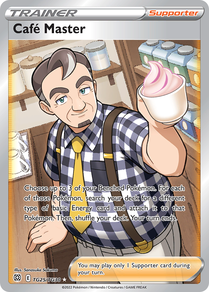
Cafe Master, Brilliant Stars Trainer Gallery TG25/TG30. The purest statement of what she does. A generic Trainer class, no Pokemon in frame at all, given a full art slot and a genuine personality: gingham shirt, yellow tie, suspenders, and a soft serve offered straight to you. It is a card about hospitality.
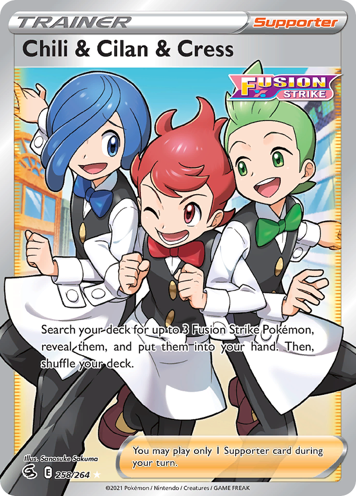
Chili & Cilan & Cress, Fusion Strike 258/264. The Striaton City Gym Leaders in waiter uniforms, mid stride, aprons flaring, three matching bow ties in red, blue and green. Sakuma is very good at group staging, and this one is pure choreography.
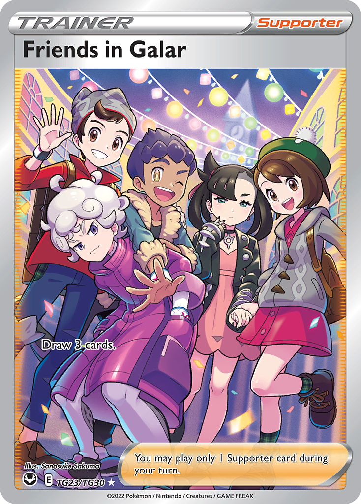
Friends in Galar, Silver Tempest Trainer Gallery TG23/TG30. Five characters crammed into one frame under festival lights and confetti, with Bede scowling in magenta at the front and Marnie deadpan with her microphone. Everyone else is delighted. Fitting five readable faces into a card this size is genuinely hard.
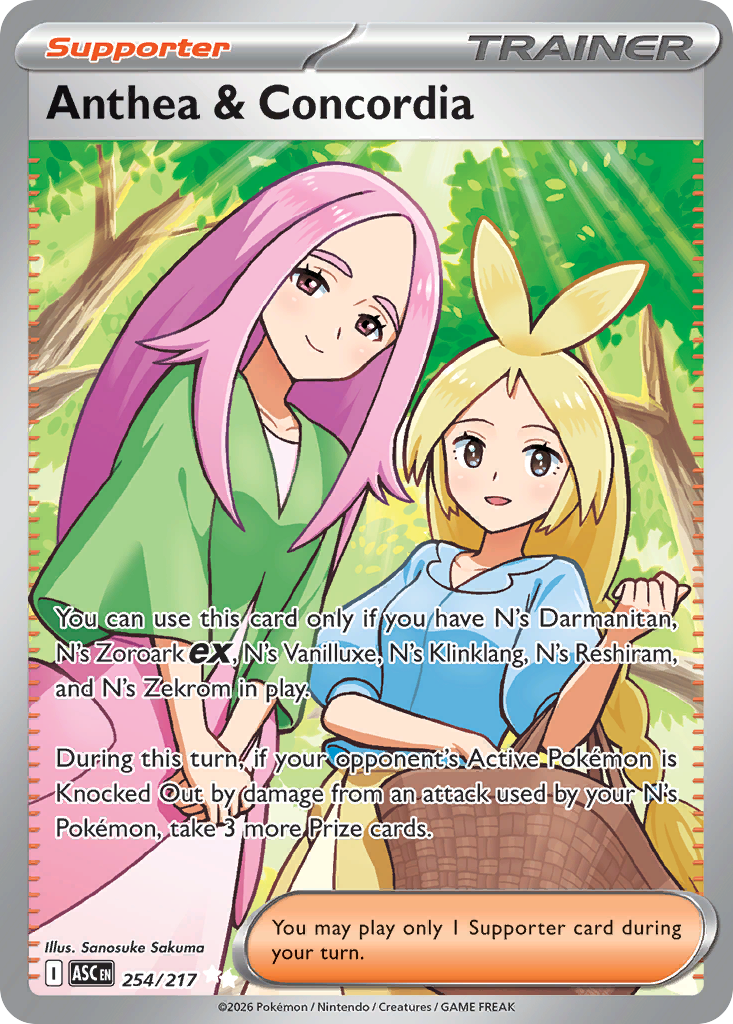
Anthea & Concordia, Ascended Heroes 254/217. Her most recent showpiece, from the January 2026 set. Two sisters in a forest with a basket, sunlight coming down in green shafts behind them. It is the softest card on this list and it shows the palette at full strength.
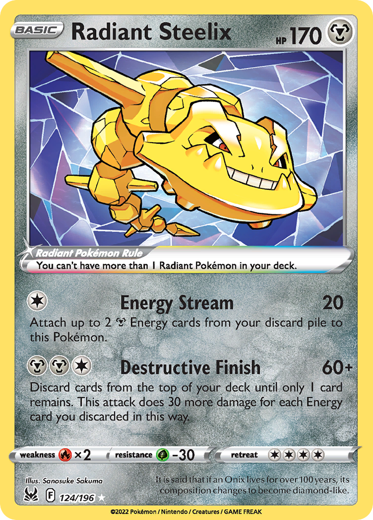
Radiant Steelix, Lost Origin 124/196. Proof she is not only a people painter. A gold Steelix bursting out of shattered pale crystal, grinning, with the whole illustration built on a hard diamond geometry that looks nothing like her Trainer work.
The cover card above is Saguaro, Paldea Evolved 270/193, her Special Illustration Rare and the best single argument for her. A man in a striped shirt and apron washing his hands at a tiled kitchen sink, surrounded by groceries, flowers and a very concerned Jigglypuff. A quiet domestic moment promoted to the rarest slot in the set.
Build a Sanosuke Sakuma binder page
An artist page works best when the artist has a consistent look, and Sakuma qualifies twice over. Her palette is narrow and her subject is narrow, so nine of her cards side by side read as one continuous world rather than nine unrelated illustrations.
Build it around the people. Where our kirisAki artist feature covers an illustrator whose Trainers become the chase card of the set, a Sakuma page is the opposite pitch: the supporting cast, the shopkeepers and cooks and nurses, collected on purpose. Put Saguaro or Cafe Master in the center as your anchor, then ring it with the everyday job classes. The warm cream and wood tones will do the blending for you, so sort by warmth rather than by color wheel and the page will feel lit rather than striped.
The budget angle is unusually good here. Her Special Illustration Rare is the only genuinely expensive card in the run, and a large share of her best character work lives on Trainer Gallery cards, plain Ultra Rares and commons. You can assemble a page that looks expensive without one. For layout fundamentals, our guide to organizing a Pokemon binder walks through artist grouping and color sorting before you spend anything. If you want a companion page on the shelf, the Naoyo Kimura feature sits well beside it, since both illustrators treat a card as a painting of a moment rather than a portrait of a monster.
Sakuma is the illustrator to learn if you have ever wondered who all those people on the routes are. She helped invent them for the games, then she gave them their own cards, and she drew them with more care than the format strictly required. Learn her name and a whole layer of the Pokemon world stops being background.